Hate the dentist? Perfect. We built this practice for you.
New patients get the full first visit — exam, digital x-rays, and a cleaning — for $79.
No lecture about how long it's been. No surprise costs. No one making you feel small
in a paper bib.
★★★★★4.9 · 428 reviews from once-nervous patients
Headphones on. Hand signal agreed. Zero lectures.
$79first visit
Take the small, brave step
Tell us where to call. We'll find you a time — and we'll be kind about it.
Judgment-free since day oneNumbing before every needleStop-anytime hand signalWritten quotes before any extra work
How we handle the fear
Not "gentle dentistry." Actual mechanics that keep you in control.
Every practice says they're gentle. Here's what that word specifically means at Willow Creek — spelled out, so you're not taking anyone's word for it.
Noise-cancelling headphones
Offered at check-in, before you're in the chair. Your playlist or ours — most of what people fear is the sound, so we take the sound away first.
Numbing before needles. Always.
A strong topical gel goes on and gets time to work before any injection, every time, without you having to ask. Most patients report the "pinch" simply never arrives.
The stop-anytime hand signal
Before we begin, we agree on it: raise your left hand and everything stops. Instantly, mid-anything, no questions. You are never trapped in the chair.
1
You talk first, upright, coat on.
The first ten minutes happen in a chair that doesn't recline, with a person whose hands are nowhere near your mouth.
2
The whole first visit takes about an hour.
Check-in, chat, x-rays, cleaning, a plain-English plan. Then you go home. No marathon, no surprises.
No lectures. No guilt trips. Not one raised eyebrow.
If it's been four years — or fourteen — you will not hear a word about it.
Nobody here will ask why you waited, sigh at your x-rays, or scold you about flossing.
You already know. That's why you're reading this at 11pm instead of sleeping.
Our job is to fix what needs fixing and make the next visit easier than this one.
Shame has never cleaned a single tooth.
MODr. Maren Okafor — and every human who works at Willow Creek Dental
The $79 first visit
Exactly what $79 buys. Exactly what happens if you need more.
New patients only
$79 $312 value
Complete exam with Dr. Okafor — upright chat first, always
Full set of digital x-rays (low-dose, quick)
A proper cleaning with our most patient hygienist
A plain-English plan — what's urgent, what can wait, what's fine
Yes, $79 is cheap — deliberately. The first appointment is the scary one, so we priced it like a small decision instead of a big one. We earn our keep by being the practice you actually come back to.
The house rule: if the exam turns up work beyond the cleaning, you get a written,
itemized quote before we touch anything — and "let me think about it" is a
perfectly good answer. No work ever starts in the chair by surprise.
From people who were scared too
428 reviews. Most of them start with "I hadn't been in years."
★★★★★4.9 out of 5· 428 patient reviews
I cried in the parking lot before my first appointment. Not exaggerating — actual tears, gripping the steering wheel. It had been six years. The front desk woman just said "you're in the right place" and nobody, at any point, asked me why I'd waited. I've been back twice. I still can't believe I'm a person who goes to the dentist now.
Danielle R.Cedar Falls · hadn't been in 6 years
The hand-signal thing sounds like a gimmick until you use it. I raised my hand once during the cleaning and everything just... stopped. She waited until I nodded. That one moment did more for my fear than twenty years of dentists telling me to relax.
Marcus T.Tri-County area · needle-phobic, his words
One small step
You've read this far. That's the hard part done.
We hold back a limited number of new-patient appointments each week so first visits never feel rushed — when the week's slots are gone, we book you into the next one. No countdown clocks, no fake panic. Just an honest calendar.
New-patient slots this week: limited to 12 — a few still open
Most dental sites are built to impress other dentists — awards, technology, stock photos of implausibly happy families. I built this one for the person it actually has to convert. Here's my reasoning.
The buyerSomeone who hasn't been in four years — and is ashamed of it
They land here at 11pm after weeks of a tooth whispering at them. They already know they should go; guilt is not the missing ingredient. What's stopping them is the picture in their head: the scolding, the pain, the surprise bill. This page exists to dismantle that picture, piece by piece, before asking for anything.
The primal driverSecurity — plus the dignity of being treated kindly
I lead with safety: nothing will hurt, nothing will cost money without warning, nothing happens without your consent. Underneath that runs a second driver — feeling important. "We built this practice for you" tells a person who expects to be judged that they're the honored guest, not the problem patient. Features like "digital x-rays" can't touch either of those feelings.
The objection in the headlineFear and shame, promoted to the opening line
Most pages hide the awkward stuff and hope proof carries the day. I did the opposite: "Hate the dentist? Perfect." names the objection in the first five words and flips it into the qualification for being here. The visitor's guard drops because there's nothing left to confess — the page said it first.
The ladder rungA $79 tripwire — and the page admits it
$79 doesn't cover the practice's cost of an exam, x-rays and cleaning, and that's fine. Its job is to shrink the first appointment into a small, safe decision. The lifetime relationship — checkups, the crown in year two, the whole family switching over — is where the practice earns. The copy says this out loud, because a cheap price with a visible reason converts better than a cheap price with a hidden one.
The hero form
Three fields a scared person can answer without thinking, sitting in the hero because the courage to book is perishable. The "Don't ask" radio option is the highest-leverage element on the page — it converts the visitors who'd abandon any form that made them quantify their shame. The warm microcopy under it turns a form control into a kept promise.
The comfort section
Anxious buyers have been burned by adjectives, so I banned them. Headphones at check-in, numbing gel before every needle, a raise-your-hand stop signal — mechanics, not mood words. Specificity is the only currency a skeptical, frightened reader accepts.
The no-lecture promise
It gets its own dark, signed, unmissable block instead of a bullet point, because for this buyer the scolding is scarier than the drill. Attaching a name — Dr. Okafor's — turns a marketing claim into a personal commitment someone can be held to.
The price card
$79 anchored against a $312 value, an exact list of what's included, and the written-quote-before-we-touch-anything rule. Cheap offers trigger a "what's the catch" reflex; the only cure is answering the catch question before it's asked, in more detail than feels necessary.
The proof pair
Status proof (4.9 stars, 428 reviews) says the crowd trusts this place. Personal proof — Danielle crying in the parking lot — says someone exactly this scared went first and came out fine. The testimonials are chosen for emotional resemblance to the buyer, not for superlatives. "Amazing practice, highly recommend!" persuades no one.
The imagery
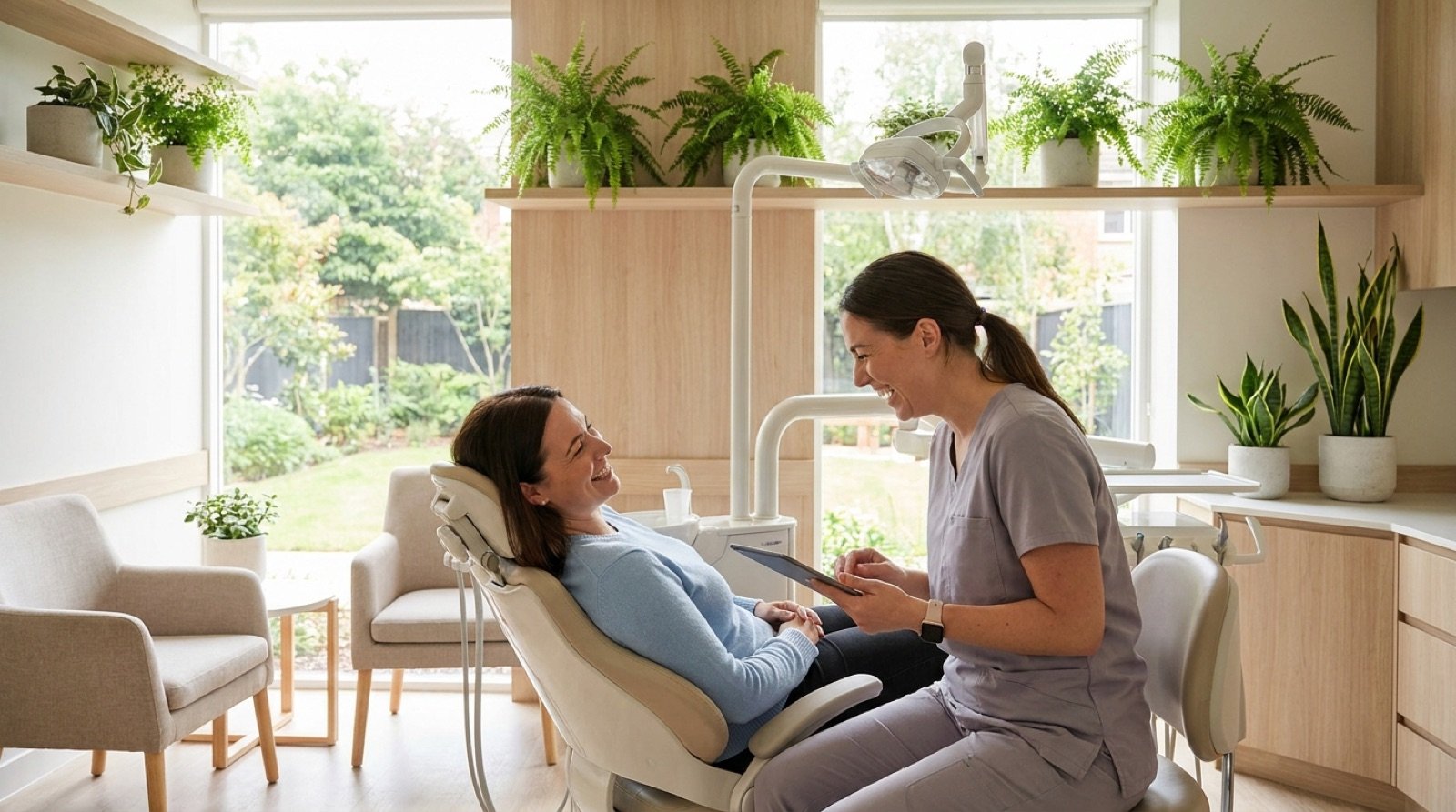
One photo, and it shows the result — a patient visibly at ease — not the service. No macro shots of drills, no gloved hands, nothing clinical enough to trigger the fear this page spends 800 words defusing. The image answers the only visual question that matters: "will I be okay in that chair?"
The urgency device
Limited new-patient slots per week — true, because unhurried first visits require it — with an explicit "no countdown clocks, no fake panic" disclaimer. With an anxiety-first brand, manufactured pressure would poison everything above it. Honest scarcity nudges; fake scarcity confirms their suspicion that dentists can't be trusted.
Questions clients ask about this design
Honest answers, from the designer
Will they judge me for how long it's been?
No — and this page is built to say so before you even scroll. The form literally has a "Don't ask" option for how long it's been, and the copy promises no lecture. For a patient who's been avoiding the dentist for years, shame is a bigger barrier than fear of the drill. A page that removes the shame first will out-convert a page that leads with technology and awards every single time.
Does the $79 offer have a catch?
The honest answer: $79 is a below-cost first visit, and the practice knows it. It exists to break the barrier of the first appointment. The page says exactly what $79 covers — exam, x-rays, cleaning — and states the rule in writing: if you need more work, you get a written quote before anyone touches anything. Transparency is what makes a tripwire price feel safe instead of suspicious.
I'm terrified of needles. Is this page really for people like me?
It's for exactly people like you — that's the whole positioning. Notice the comfort section doesn't say "gentle dentistry," which is a platitude every practice claims. It lists concrete mechanics: numbing gel goes on before any needle, noise-cancelling headphones are offered at check-in, and you get a raise-your-hand signal that stops everything instantly. Specifics are believable; adjectives are not.
How long does the first visit take?
The demo copy says about an hour, and that detail is on the page deliberately. Anxious buyers imagine an open-ended ordeal; telling them the exact shape of the visit — check-in, chat, x-rays, cleaning, plan, done — shrinks the unknown, and the unknown is most of the fear. Never make a nervous visitor guess what happens after they submit the form.
Would this page actually get a dental practice more patients?
It converts the traffic it gets — it doesn't create demand from nothing. Every town has thousands of people who know they should see a dentist and haven't in years. They're already searching, already guilty, already scared. This page doesn't have to convince them dentistry matters; it just has to stop leaking the demand that already exists by removing fear and shame at the door.
Why is the form at the very top of the page?
Because making someone scroll to reach you is a tax on your own lead flow. A visitor who lands here has usually spent weeks working up the nerve to look for a dentist. The moment of courage is brief — the form has to be right there when it happens. Every CTA below the fold just brings that same form back into reach.
 ★★★★★
4.9 · 428 reviews from once-nervous patients
★★★★★
4.9 · 428 reviews from once-nervous patients