A designer’s portfolio · nineteen working demos
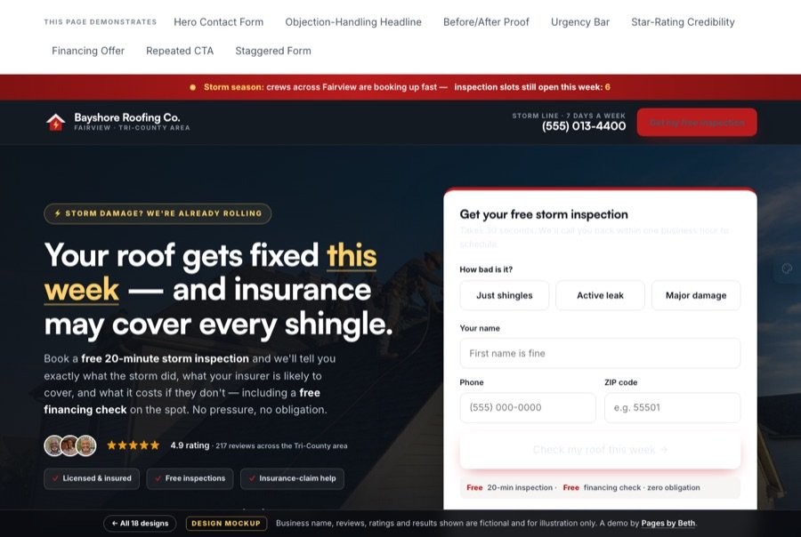
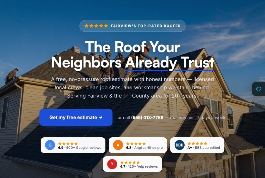
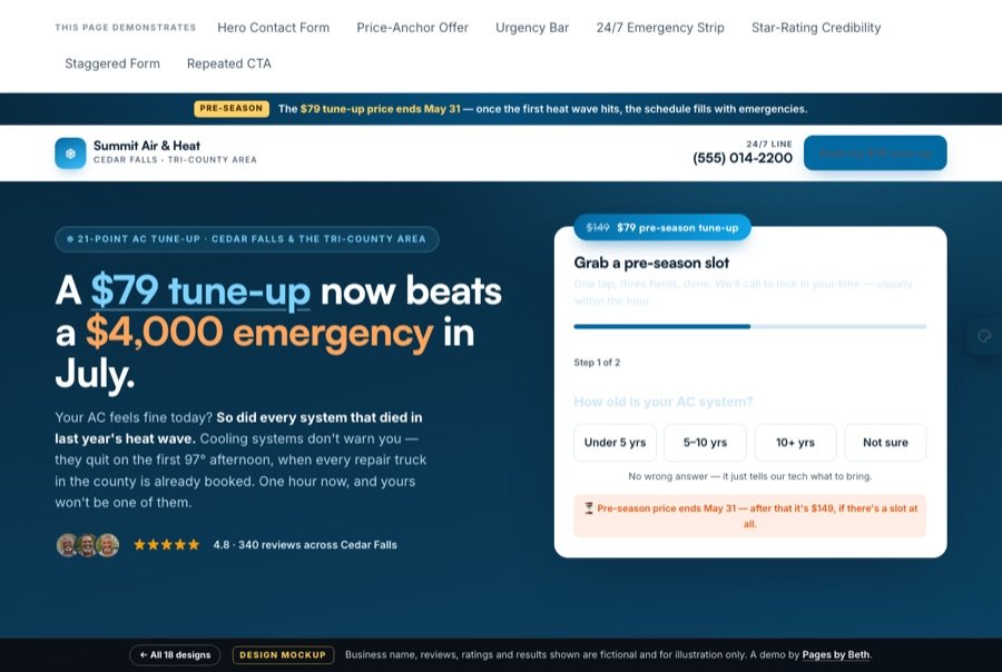
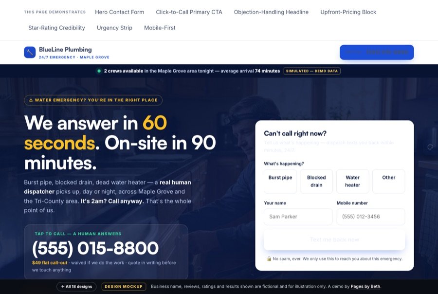
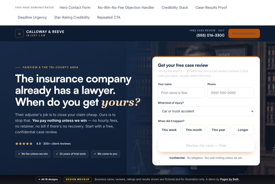
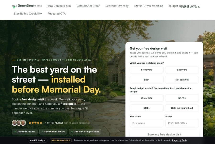
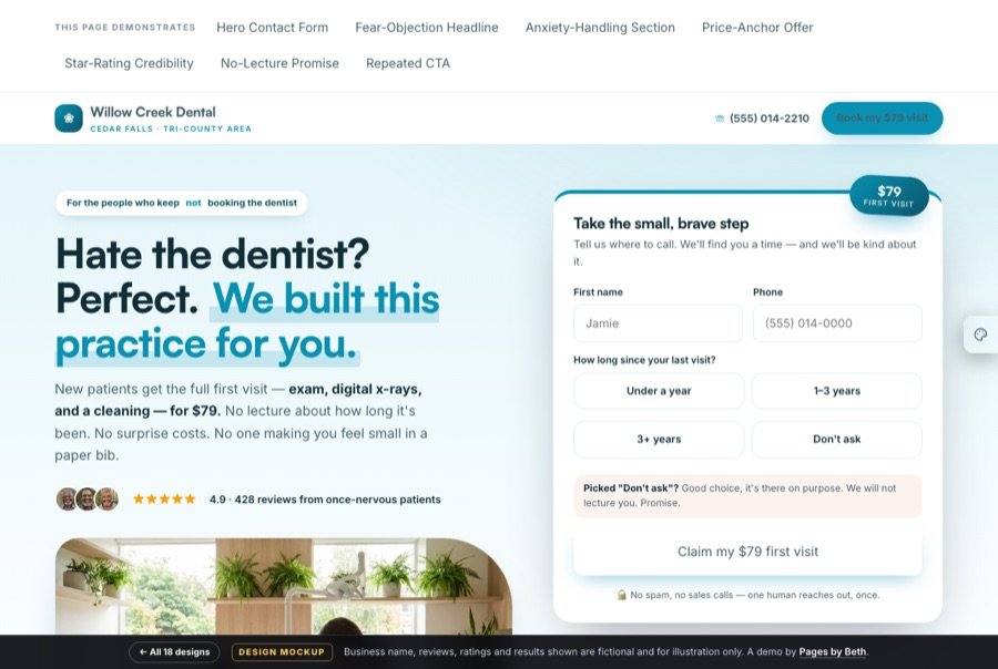
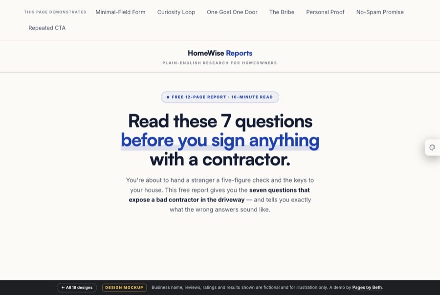
Most local businesses send their ad traffic to a website and wonder why the leads are so expensive. I build the other thing — one page, one goal, one door — for roofers, HVAC, plumbers, insurance agents, mortgage brokers, attorneys, and real estate. Every demo below is real, interactive, and explains itself.

The gallery
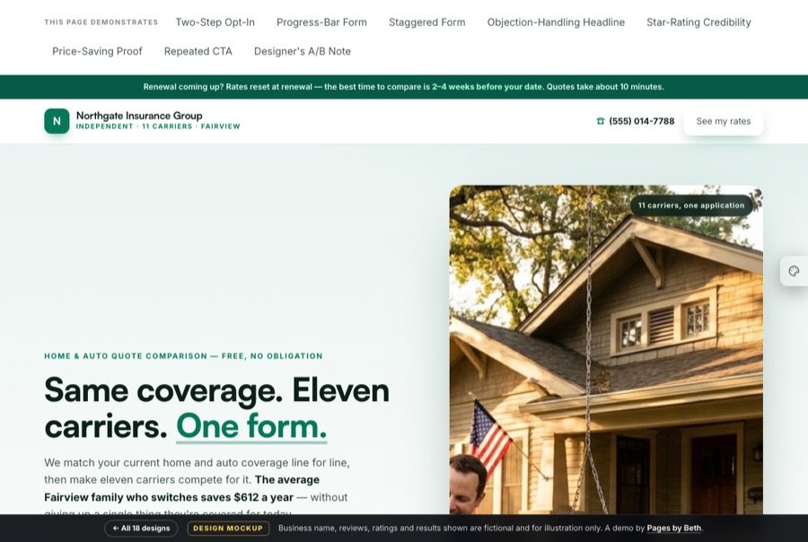
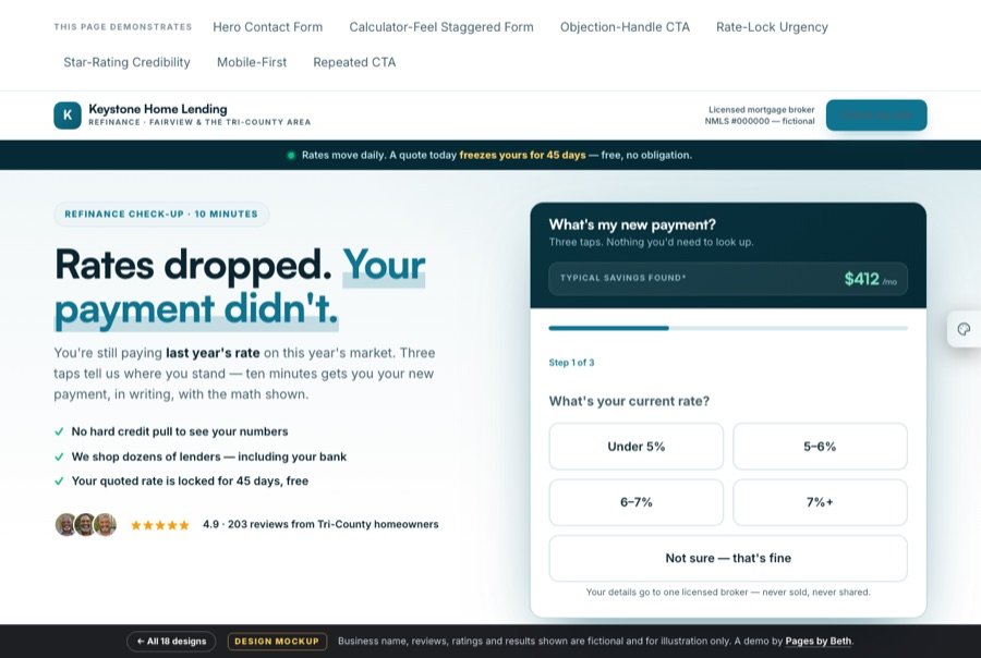
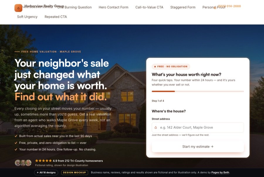
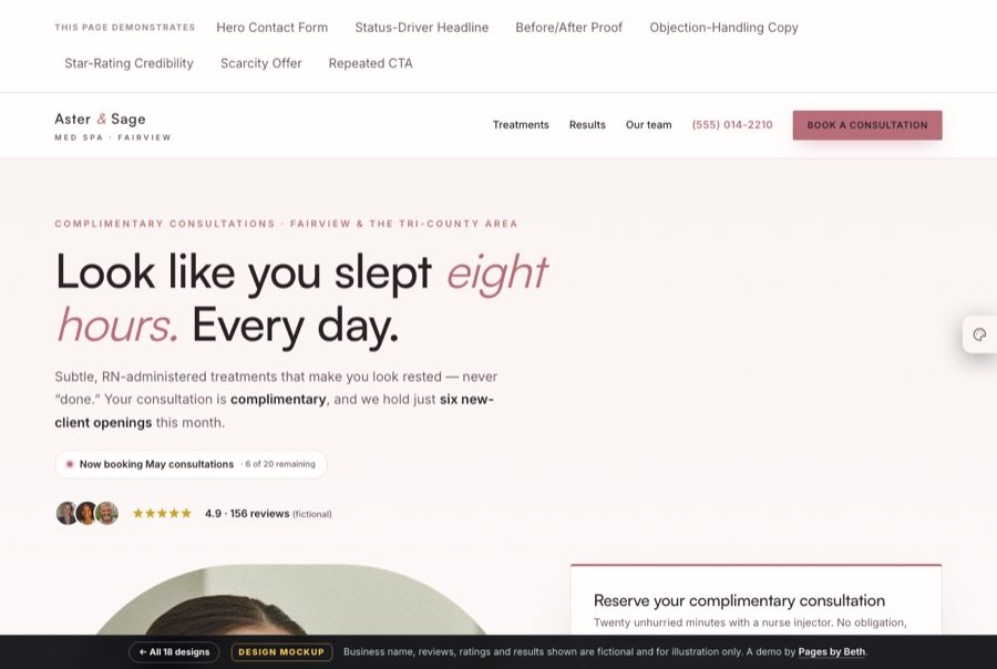
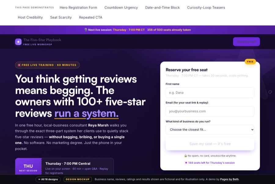
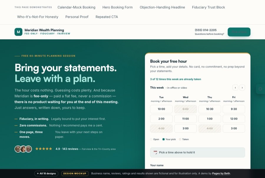
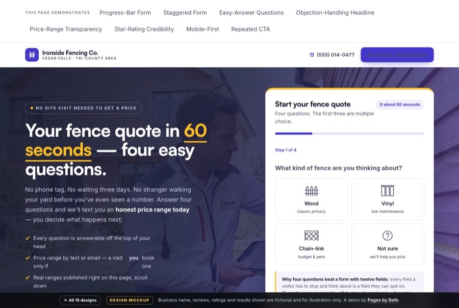
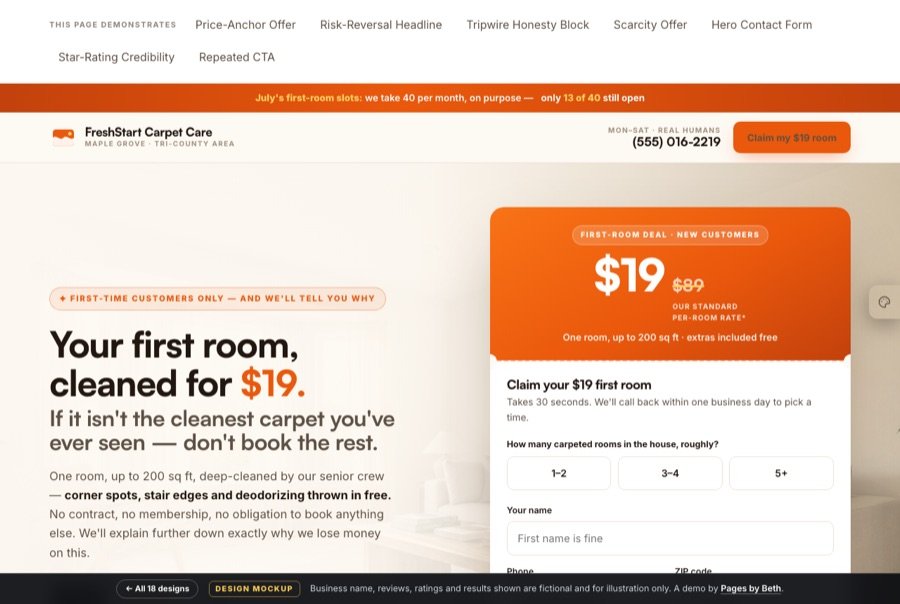
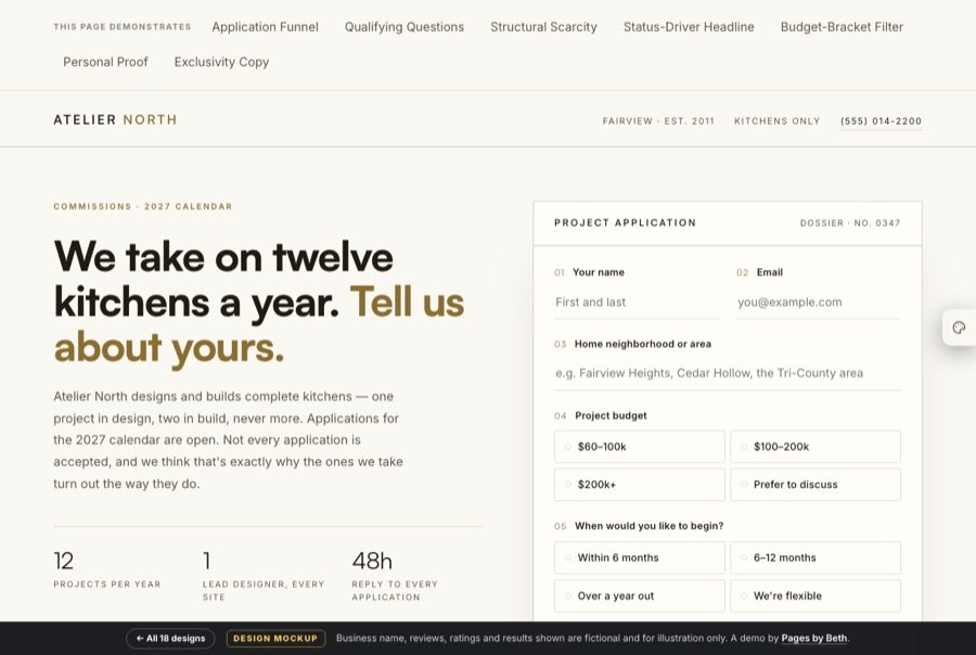
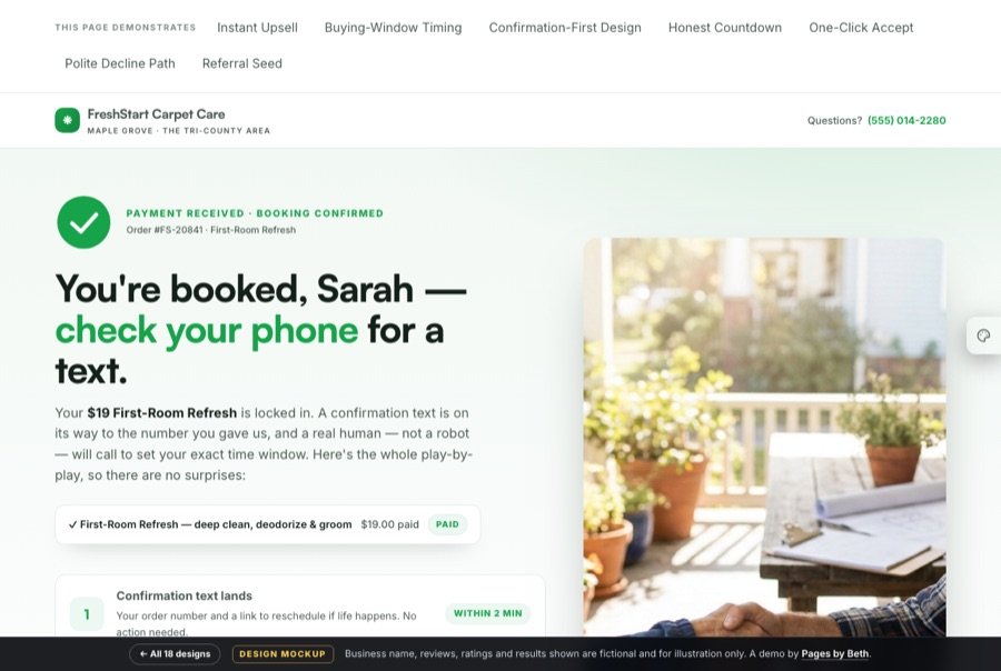
These aren’t screenshots — each card opens a full, working demo you can scroll, click, and poke at. The little tags tell you which conversion techniques each page demonstrates; click them inside any demo and the page will show you where, and tell you why. And once you’re in a demo, try the palette tab on the right edge — every preset re-brands the page in a click, so you can picture it in colors closer to yours. Your exact brand colors are no problem either: supply your palette at the start of a project and every page ships in it.


What I believe
Some designers make you scroll to find the form. Some hide it behind a second click. For a local business, that’s a tax on your own lead flow. When a homeowner is standing in the rain looking at a hole in their roof, the form goes in the hero. Old-school? Maybe. It also works.
A website is a brochure — navigation, an about page, twelve ways to leave. A landing page takes only what matters onto one page with one goal. For paid clicks the difference in cost-per-lead isn’t marginal; it’s multiples.
A roofer isn’t selling shingles; he’s selling the water stops coming through your daughter’s ceiling. People buy on primal emotion — security, status, money, time — and justify with logic afterward. Every headline on every page here is written against a driver, not a feature list.
If the ad promises a $99 tune-up and the page opens with your company history, people bounce — and nobody ever finds out why the campaign “didn’t work.” Ad congruency is the silent killer nobody mentions. Same offer, same words, same color, ad to page.
Go deeper
Anyone can make a page pretty. These six short reads explain what makes one convert — and they’re the same principles every demo above puts into practice.
The seven-part checklist, the headline formula, and why the form goes up top.
Read it → 02Primal drivers, the security-and-status engine, and the objection hiding in every headline.
Read it → 03Lead magnet to tripwire to core sale — why growth is multiplicative, not additive.
Read it → 04Why a form that dumps into an inbox is a leaky bucket — and what the fix looks like.
Read it → 05Two good roads. Which one fits you — for a landing page or a whole site.
Read it → 06The process start to finish — plus my hosting policy and what changes cost later.
Read it →
The designer
I’ve been designing lead-generation pages for local businesses since 2007. Before that I spent fourteen years teaching elementary school, which turns out to be perfect training for this work: if you can hold the attention of twenty-six eight-year-olds, you can hold the attention of a homeowner with a leaking roof.
I’m obsessive about clarity. Every page you see here was built around one question — what is the one thing this visitor needs to do, and what’s stopping them? — and everything that didn’t serve the answer got cut.
Work with me
Every project runs through Fiverr. That means escrow, buyer protection, and a dispute process that doesn’t depend on you trusting me. You’re not wiring money to a stranger on the internet, and you don’t have to take my word for anything.
I prefer it that way. You should too.
Visit my Fiverr profile →