First: A Landing Page Is Not A Website
This is the mistake underneath most “the ads didn’t work” stories. A website is a brochure: navigation, an about page, a gallery, a blog, twelve different things a visitor can click. That’s fine — a business should have one. But a brochure is where paid traffic goes to die, because every extra door is another way to leave without calling you.
A landing page takes only the parts that matter and puts them on one page with one goal and one door. Usually the offer your ad promised isn’t even on your website — so the click lands on something that doesn’t match what it was promised, and it bounces.
A website (the brochure)
- Navigation with six sections
- About page, gallery, blog, careers
- Several competing calls to action
- The ad’s offer is nowhere on it
- Visitor wanders, then leaves
A landing page (the machine)
- One page, one goal, one door
- The exact offer from the ad, front and center
- A form in the hero, above the fold
- Proof, desire, urgency — nothing else
- Visitor decides, then acts
For paid traffic, the difference in cost-per-lead is not marginal — it’s multiples. Never send paid traffic to a website. If you take one sentence from this whole site, take that one.
The Seven-Part Checklist
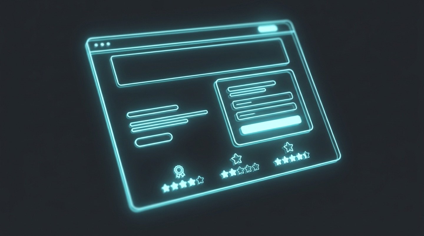
Every page in the gallery hits these, roughly top to bottom. It’s an extended version of the oldest formula in advertising — attention, information, desire, action — with the parts modern pages tend to forget bolted back on.
- A good offer, plus honest urgency. The offer is the reason to act — not your logo, not your history. Pair it with a real time limit or genuinely limited spots and you have the strongest conversion combination there is. (Fake countdowns and invented scarcity are lies, and people can smell them. More in the psychology piece.)
- Attention — the headline. Front and center, doing the heaviest lifting on the page. It gets its own section below.
- Information — just enough to decide. They’re requesting a quote, not buying a house. Lack of understanding causes bounces; so does a wall of text. Give exactly what a reasonable person needs to say yes to the next step.
- Simplicity — make acting effortless. Never bury the action. If a visitor has to hunt for how to contact you, you’ve taxed your own lead flow.
- Desire — mostly through imagery. Show the result of buying, not the process of the service: the finished roof, the transformed yard, the confident smile. The gap between what they have and what they see is desire. A before/after is the single most persuasive image type in local services, which is why three of my demos are built around a draggable one.
- Proof — two kinds, and you want both. Status proof: the rating, the review count, the badges — “4.9 on Google, 105 reviews” works because nobody believes a stranger, but everybody believes a hundred strangers. Personal proof: a testimonial with a name and a face. One is credibility at a distance; the other is a human vouching up close.
- Call to action — clear, repeated, and unmissable. Once above the fold, then roughly every screen-height after. Below the fold the page should re-run the arc: information → CTA → offer details → testimonials → final CTA.





“They answered on the first ring, and the roof was done by Friday.”
Donna W. · Fairview
That block above is the pattern in miniature: the avatar cluster and the review count are status proof — a hundred strangers vouching at a distance. The face and the quote are personal proof — one human vouching up close. (The people and numbers shown are illustrative, like everything in my demos — your page uses your real ones.)
The Headline Formula
There are two situations, and they need different headlines.
If the product is genuinely unique, just say what it does, plainly. Novelty does the work.
If the product is not unique — and a roofer, a cleaner, a dentist is never unique — the formula is:
Big value + the biggest objection, handled.
“Affordable and reliable cleaners for homeowners in Surrey” handles price and reliability in eight words. “You don’t have to be an SEO pro to rank higher on Google” handles I’m not technical. “Ace the SAT with 10 minutes of studying a day” handles it’s too much work. The objection you handle is almost always an unmet primal driver — usually risk or money — and naming it is what makes the value believable.
Placement rule: strong offer → offer in the headline, value hook in the sub-headline. Softer offer → value headline, offer in the sub-headline.
The Contrast Engine
The best headlines run on contrast: the distance between A — what the reader currently believes — and B — your contrarian, better alternative. That gap is what produces the involuntary “wait, what?” that keeps someone reading.
Two ways to build it
Stated contrast names both sides: “A $79 tune-up now beats a $4,000 emergency in July.” The reader believes their AC is fine; the headline quietly informs them that the ones that die in a heat wave all felt fine in May.
Implied contrast names only your side and lets the old belief hang in the air: “Hate the dentist? Perfect. We built this practice for you.” Nobody expects a dentist to lead with that — which is exactly why it works.
Clarity first, contrast right behind it. A headline that’s clever but unclear loses to a headline that’s clear and ordinary, every time. If a sentence can be read two ways, rewrite it.
Buttons: Five Kinds Of Ask
- Action — “Get a quote.” The default. Fine.
- The offer itself — “Get your first clean for $19.” The button restates the deal.
- Call-to-value — “Show me my home’s value.” The button promises the result of clicking.
- Objection-handle — “See my rate — no credit-score hit.” The button dissolves the fear at the exact moment of hesitation.
- Price anchor — “Start for $1.” The number does the persuading.
Across the nineteen demos you’ll find all five, each matched to its moment. The microcopy under the button matters too — “Takes 60 seconds. No obligation.” costs nothing and answers the last silent question before the click.
Forms: The Questions Decide The Conversion Rate
Don’t overthink the form; overthink the questions. Two rules:
Stagger it. Open with easy radio buttons — “How many rooms? 0–3 / 3–6 / 6+” — before asking for contact details. Each tap is a small yes, and small yeses add up to momentum. A multi-step form with a progress bar beats one long form so reliably that I built a whole demo around it.
Every question must be answerable off the top of the head. Give brackets, not blanks. A question the visitor has to go look up — a model number, an exact square footage — is a question they bounce on. “Not sure” should always be an acceptable answer.
Ad Congruency: The Silent Killer
The page must match the ad that sent the visitor — in design, in color, and above all in the offer. If the ad says “$99 spring special” and the page opens with your company history and a different price, the visitor doesn’t puzzle it out. They assume they clicked the wrong thing and leave. Then the campaign gets blamed, the page gets blamed, and nobody ever finds out the ad and the page were simply telling two different stories.
Same offer, same words, same visual temperature, ad to page. It’s unglamorous, and it’s worth more than most redesigns.
And Yes — The Form Goes In The Hero
Some designers make you scroll to find the form. Some hide it behind a second click. For a local business, that’s a tax on your own lead flow. When a homeowner is standing in the rain looking at a hole in their roof, the form goes in the hero. Old-school? Maybe. It also works.
I show the two-step alternative honestly on the insurance demo — it’s a worthwhile A/B test, with a real trade-off I explain right on the page. Showing the alternative and saying why it isn’t my default is, I think, exactly what you should want from someone you’re about to hire.